The Next iteration: How I built my new blog

Spencer Miskoviak
December 14, 2021
Photo by Kieran White
Over two years ago, I built a new blog with Gatsby and moved my content off Medium to have more control over the experience. Since, I've published over 20 new blog posts and felt like now was the right time to revisit the overall experience of this blog.
I haven't published as frequently this past year because of a focus on the Practical Abstract Syntax Tree course and then the next iteration of this blog. Now that the course and blog are released, I wanted to share a bit about how it's built.
Motivations
As with most projects, I had a few motivations for rebuilding this blog.
- Design & experience: the biggest motivation was updating the overall look and feel. The existing design used many colors and gradients, but it started to feel dated and distracted from the core content. It was also static, which most blogs are by nature, but I wanted to make it a more dynamic and interesting experience.
- Content updates: on top of the design and experience, I also wanted to refresh some of the content. The previous iteration included podcast episodes, YouTube videos, and recently read books. I haven't been actively maintaining nor creating these types of content so I wanted to remove them (for now at least). This focuses the blog on the content that I'm actively maintaining and creating: blog posts, a course, and open source projects.
- Learning: the final motivation was trying to learn some new technologies and patterns. The biggest were Nextjs, vanilla-extract, generative illustrations, and several others covered below.
Previous iteration
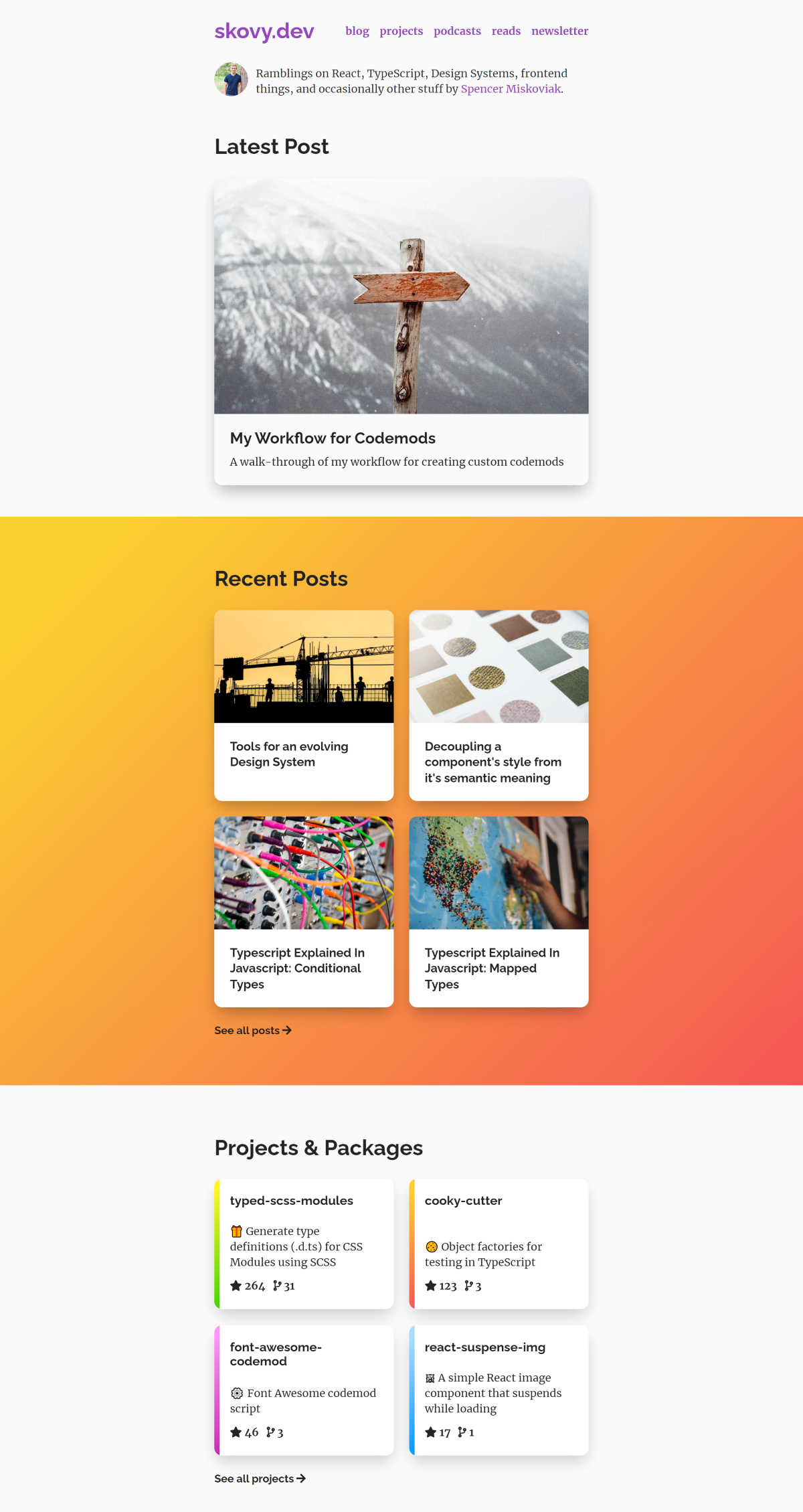
Before digging into the details, you can see the result for yourself. You're viewing the next iteration of this blog right now!
If you hadn't visited the previous iteration of this blog, here's a screenshot below to compare. Or, play around with the previous iteration on the internet archive.
Design motivations
As mentioned, I wanted to move away from the many colors and gradients. This led to thinking about a mostly black and white design, leaving color only for accents. With this in mind, I started collecting pictures and screenshots of products, branding, typography, and geometric patterns from coffee shops, dribbble, shampoo bottles, and anything else that caught my eye. Throughout this process I relied on bouncing many design ideas off Brad Turner, which helped form and solidify the overall direction.
This process helped set the overall look, but it still didn't address the static nature of blogs.
Generative illustrations
For a while, I've been exploring the idea of generative design. For example, components.ai and tinkersynth. Other ideas I explored included randomly generating design tokens (spacing, colors, typography, etc.) to create visually unique design systems built with the same components, or randomly generating SVGs.
I already wanted to include geometric patterns so turning these into generative illustrations seemed like a fun way to make the experience more engaging and unique.
These generative illustrations are primarily on the home page. They're all SVGs generated randomly within some bounds. None of them are truly random, because that would likely lead to visually undesirable illustrations.
Creating the illustrations
For each of the illustrations, I followed a general process:
- Build a static SVG of a geometric pattern. For example: squiggly lines, inset circles, or shapes.
- Determine which parameters could be changed and still result in a visually desirable illustration. For example: size, length, color, shape, direction, or position.
- Define bounds for each of these values to avoid visually undesirable illustrations such as overlapping or touching lines. For example: the inset circles are randomly positioned within one another, but never overlapping or touching.
- Generate random values within the bounds and use these values to create the SVG illustrations. For example: using
Math.random.
This process often required several iterations and lots of testing to produce desirable illustrations.
Generating desirable illustrations
A desirable illustration is somewhat subjective. For me, I wanted a unique but intentional experience. If the illustrations were always perfectly symmetrical that doesn't feel unique. Similarly, if the they were always completely random that doesn't feel intentional.
 Undesirable: too symmetrical and perfect. It could use some randomness to make it feel more unique.
 Undesirable: too random and chaotic. It could use some pattern to make it feel more intentional.
 Desirable: a clear pattern but with some randomness to give it a unique character.
I tried to balance both of these attributes by introducing some randomness to make it unique each visit, but not too random where the original intent was lost. This process was a bit different for each illustration since they have unique properties, but it was guided by the same criteria.
Deterministic illustrations
There was still one problem, if you saw a generated illustration you really liked there was no way to reproduce the identical illustration once you left the page. In order to allow reproducing the same illustrations across visits there needed to be a way to deterministically generate the random values.
To accomplish this, all uses of Math.random were replaced with seedrandom which accepts a seed that is used to generate the random numbers. When the identical seed value is used, it'll return the identical random values in the same order. So rather than generating a bunch of random numbers, a single random 6-character seed string is generated. This is used to seed the number generator which in turn generates the random numbers used in all the illustrations. That means using the same seed will generate the same illustrations. The seed value can be passed as a query parameter to allow sharing a link to see the identical illustrations.
Example: Inset circles
The inset circles illustration was mentioned above and is used on the home page.
Let's look at an example of the different parameters and how they impact the output illustration.
While working on these illustrations, I manually adjusted these values to fit my preferences for the generated illustration. For the actual inset circle illustration, all of these values are fixed to these default values. The only value that is randomly generated is the random wiggle which randomly offsets the center point of the circle by a few pixels.
Try increasing the maximum random wiggle value and notice how it gives the illustration a bit more character than perfectly symmetrical inset circles. However, notice how increasing the maximum random wiggle value so it's greater than the spacing between circles value starts making the circles touch and overlap?
This an example of defining bounds for these random values to avoid these states. In this case,
the maximum random wiggle is between 0 and this value including a random sign (+/-). In practice, this value is constrained to at least less than half the spacing between circles value to avoid any touching or overlapping circles.
Now, try clicking the Randomize button which truly randomizes all these values. Notice how many of these truly random values produce visually undesirable illustrations? This is why many of the values need to be fixed or randomized only within a set range.
All the illustrations follow this same pattern. If you haven't, try regenerating the illustrations on the home page a few times with the regenerate button in the lower right corner or the footer.
Dark mode
Another big design update I wanted to make was supporting dark mode. First, supporting dark mode is becoming more and more of an expectation. Visiting my previous blog was always white with bright colors and I wanted to support every viewer's preference (including my own!). Second, I wanted to learn how styling and theming worked with vanilla-extract, a library for zero-runtime stylesheets in TypeScript.
This entire blog is styled and themed with vanilla-extract. It caught my attention because it feels like a CSS-in-JS library (the CSS is written in TypeScript) but with none of the typically associated runtime costs, because it's all evaluated at build time.
Additionally, it has first-class support for TypeScript with an API intentionally designed to be strongly typed. After using it to build this blog, I can confirm it delivers on both of these promises. If I were starting a large design system from scratch, I think it would be a fantastic tool. A blog like this probably isn't the ideal use case, but it did make theming trivial. The only downside is that the API can be somewhat verbose, and tricky to remember for more complex selectors. However, I expect this as a cost of strong typing.
The only thing vanilla-extract doesn't handle is the theme switching itself. It provides the class name generated for a theme that needs to be applied to the document.
To support this, the first step was to create a custom document for Nextjs to use. This allows adding a script tag with an inline snippet of JavaScript to apply the theme immediately on load to prevent any flickers.
// _document.tsx

import Document, { Html, Head, Main, NextScript } from "next/document";

import {
  // `themeKey` is a variable that defines the
  // local storage key the theme is persisted to.
  themeKey,
  // `lightModeKey` and `darkModeKey` are variables for the
  // value persisted to local storage to represent either the
  // light or dark theme preference.
  lightModeKey,
  darkModeKey,
} from "../src/components/theme-toggle/theme";

// `darkMode` is the class name generated by vanilla-extract with `createTheme`:
//   https://vanilla-extract.style/documentation/styling-api/#createtheme
import { darkMode } from "../styles/theme.css";

class AppDocument extends Document {
  render() {
    return (
      <Html lang="en">
        <Head>
          {/*
            Set an inline script to apply the dark theme class
            name to override the light theme when appropriate.
          */}
          <script
            dangerouslySetInnerHTML={{
              __html: `((d,c)=>{try{var p=localStorage.getItem('${themeKey}');if(p===d||(p!=='${lightModeKey}'&&matchMedia('(prefers-color-scheme:dark)').matches)) document.documentElement.classList.add(c)}catch(e){}})('${darkModeKey}', '${darkMode}')`,
            }}
          />
          {/* ... */}
        </Head>
        <body>
          <Main />
          <NextScript />
        </body>
      </Html>
    );
  }
}

export default AppDocument;
This script will end up with a snippet that looks something like the following code when the interpolated values are replaced.
((d, c) => {
  try {
    var p = localStorage.getItem("theme-preference");
    if (
      p === d ||
      (p !== "light" && matchMedia("(prefers-color-scheme:dark)").matches)
    )
      document.documentElement.classList.add(c);
  } catch (e) {}
})("dark", "theme_darkMode__1hr4ozx16");
Further replacing these variables with more descriptive names results in the following code snippet.
((darkModeKey, darkModeClassName) => {
  // Wrap the whole function in a `try` to avoid breaking the whole site
  // in case there are any issues. For example, if there's an error trying
  // to read from local storage. Worst case, the light theme is always applied.
  try {
    // Try to read any existing preference from local storage.
    // This hasn't been set, but will be set by the theme toggle.
    var preference = localStorage.getItem("theme-preference");

    // When a viewer explicit toggles dark mode, then apply the dark mode
    // theme class name to the root of the document (`html` element).
    // Similarly, if a viewer did not explicitly toggle light mode and
    // their system preference is dark mode then also apply the dark theme.
    // This way always gives priority to the toggled value but
    // defaults to the system preference.
    if (
      preference === darkModeKey ||
      (preference !== "light" &&
        matchMedia("(prefers-color-scheme:dark)").matches)
    ) {
      document.documentElement.classList.add(darkModeClassName);
    }
  } catch (e) {}
})("dark", "theme_darkMode__1hr4ozx16");
This will now apply the dark theme class name generated by vanilla-extract when appropriate. However, this doesn't provide a way to explicitly toggle the theme.
The theme toggle
The theme toggle allows switching between light and dark mode. These are commonly represented with a sun and moon icon respectively. I wanted to follow this pattern and introduce an animated transition between the two states with framer-motion, a motion library for React.
Try clicking the toggle to transition between the sun and moon icons.
This was built as a single SVG with 9 circle elements and one path used to create a clip path. To create the sun, one circle is rendered in the middle with 8 smaller circles surrounding it to represent sun rays. To transition to the moon state, the 8 circles are translated and faded behind the inner circle. Simultaneously, the path is applied to the circle to clip the circle to a moon shape. To transition back to the sun is the reverse: removing the clip path and translating the circle elements back out.
You may notice that the 8 sun ray circle elements are staggered as they animate in starting from the top of the inner large circle and going clockwise. This orchestration is straightforward with the staggerChildren option provided by framer-motion.
The default state of this toggle is determined using a similar snippet as the script above. Instead of applying a class name, it returns the currently applied theme name. Clicking the toggle then uses localStorage to persist the theme preference for the next visit.
Technologies and tools
While this post has highlighted a few of the technologies and tools used to create this blog, there were many I relied on.
- Nextjs: a React framework. Hosted by vercel.
- TypeScript: strongly typed JavaScript.
- vanilla-extract: a zero-runtime stylesheets in TypeScript library. All of the styling and theming was done with this library. For more details on how this was used, see above.
- framer-motion: a motion library for React. This was used for the theme toggle and regenerate button. For more details on how this was used, see above.
- mdx-bundler: a package to compile and bundle MDX files and their dependencies. The previous iteration of the blog was markdown. This iteration now supports MDX which means it's possible to import and render React components directly in the markdown. For example, the embedded circle playground and theme toggle demos above were only possible as a result of this.
- focus-visible: a polyfill for
:focus-visible. It adds afocus-visibleclass to the focused element, in situations the:focus-visiblepseudo-selector should match. This was used to only show focus styles when using a keyboard and avoid them when interacting with a mouse. - seedrandom: a seeded random generator. This provides a way to deterministically generate random numbers given the same input. For more details on how this was used, see above.
- React Context: a way to pass data through the component tree. React Context is specifically mentioned because it was used to build the generative illustrations. The seed value is stored in React Context so whenever that seed value changes it causes all illustrations to re-render with the new seed value and therefore new illustrations.
- next-sitemap: a sitemap generator for Nextjs.
Conclusion
This iteration of the blog captures many of the ideas I had when originally thinking about refreshing it, and overall I'm pleased with the result.
The design and feel is much simpler, but still provides a unique experience each visit with the generative illustrations. It's also focused on the content I'm actively creating and maintaining and removes some of the experimental content. Finally, I certainly deepened my knowledge of Nextjs, vanilla-extract, framer-motion, and some of the other technologies I wanted to better understand. This blog is still a work in progress, and there's always improvements that can be made.
What's your favorite generative illustration? Did you find any interesting seed values? Do you have ideas for other patterns? Share them with me on Twitter!
Tags:
course
Practical Abstract Syntax Trees
Learn the fundamentals of abstract syntax trees, what they are, how they work, and dive into several practical use cases of abstract syntax trees to maintain a JavaScript codebase.
Check out the course