Decoupling a component's style from it's semantic meaning

Spencer Miskoviak
September 17, 2020

Photo by Jean-Philippe Delberghe
When working on reusable components, such as those in a design system, it
can be common for a component to contain what seems like a single functionality,
such as a Button component. It's functionality is generally to perform an
action. However, if that action opens a dialog, it should probably be a button
element, whereas if that action navigates to a new page it should probably
be an a (anchor) element.
There are a number of ways this could be handled. In this example, it could be
inferred if an href prop is present. Or, there could be a boolean prop
such as isAnchor or isButton to opt-in, and default to the other element.
Either of these could work with this example, but what about another component
that may need to support three or more element types? Or, what if there isn't
a prop such as href that can imply the element type?
The as prop
As you can see with only this one example, it's hard to expand any of these
patterns more generally. This is where the as prop pattern can help solve
these issues, and provide a general solution for most components.
Continuing with this Button example, how would this look using the as prop?
interface ButtonProps {
  as: "a" | "button";
}

const Button: React.FC<ButtonProps> = ({ as: Tag, children }) => (
  <Tag>{children}</Tag>
);

// Example usage:
//  <Button as="button">Click me!</Button>
//  <Button as="a">Click me!</Button>
Here, a Button component is defined with two props: as and children.
The children prop controls the Button contents to display. The as prop controls
the rendered element, or HTML tag. Now there is a single component to capture
an action, but the proper semantic element can be controlled depending on the use
case.
There are several problems with this example. For example, it doesn't accept
the proper onClick or href attributes for button and a elements.
It may also seem tedious to make the as prop required, and it could be tempting
to assign a default value for the as prop and make it optional.
interface ButtonProps {
  as?: "a" | "button";
}

const Button: React.FC<ButtonProps> = ({ as: Tag = "button", children }) => (
  <Tag>{children}</Tag>
);

// Example usage:
//  <Button">Click me!</Button>
//  <Button" as="a">Click me!</Button>
This can work for simple cases, but we'll cover a few reasons (accessibility and type-safety) why it can be preferable to make it required.
Advantages
The primary advantage of the as prop is that it decouples a component's
visual appearance and functionality from the semantic markup.
For example, let's say there are unique styles for a "button" and an "anchor" (or a "link").
The "button" likely has some padding and a background color, whereas the "anchor" probably
has an underline. However, there are some cases that need to look like an
"anchor" but are semantically a button element. There needs to be a component to
handle this use case: a button element that looks like an "anchor." What about the
reverse? An anchor element that looks like a "button"?
Based on these examples, it starts too look like a two by two matrix with the
appearance ("button" or "anchor" styling) on one axis, and the semantic element
(button or a) on the other axis. This results in four combinations and could
each be treated as their own component: Button, ButtonAnchor, Anchor,
AnchorButton.
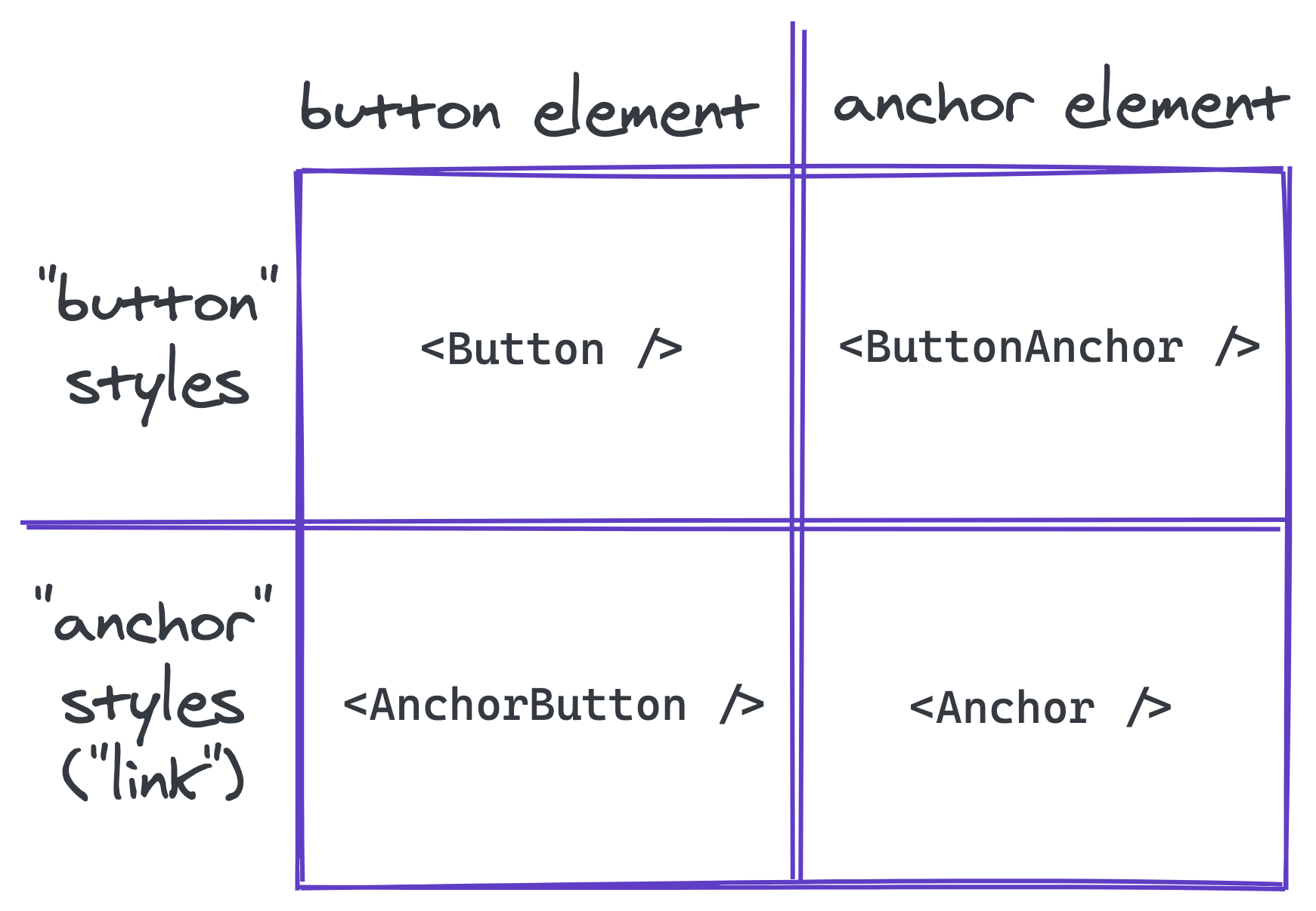
This naming could be improved, but it's confusing which to use in which case? Does the styling, or element type have precedence in the naming? Also, nearly identical functionality and styling are now duplicated across these components.
Instead, if all styles were combined as a single prop (eg: variant), then the
proper element can be controlled via the as prop on a single Button component
to handle all of these us.
// Looks like an "anchor" ("link") but is a `button` element
<Button as="button" variant="link">Click me!</Button>

// Looks like a "button" but is an `a` (anchor) element
<Button as="a" variant="secondary">Click me!</Button>
Additionally, this can also help improve accessibility. For example, a Heading
component will need to render different typography styles and should also render
an appropriate heading element (h1 - h6). Often, global styles will be
applied to each heading element, meaning the heading is chosen for it's visual
appearance, which may or may not properly align with the page's hierarchy.
If used incorrectly, this can harm the page's accessibility. Instead, by
decoupling the visual appearance from the semantic meaning this problem can be
alleviated.
<Heading as="h1" size="1">Heading Level 1</Heading>
<Heading as="h2" size="2">Heading Level 2</Heading>
<Heading as="h2" size="1">Heading Level 2 (but looks like 1)</Heading>
Any visual appearance can now be used with any element. In general, the as
prop and size prop will usually align (h1 as size 1) but there can be
cases where this may not be true. With this API, it's now possible to mix the visual
appearance with the proper underlying element. It might be tempting to default
as based on size. For example, if size is 1, default to h1. However,
by making it required, every usage now requires asking two questions: "what
should this element be?" and "how should this look?". Each answer maps directly
to these props. Relying on global heading element styles, or relying on a single
prop combines these two questions into a single answer. This usually leads to
picking the correct visual appearance, and neglecting the proper semantic element.
Disadvantages
The biggest disadvantage is that it's one more prop, which increases the surface
area of the API. It can also feel potentially redundant (eg: <Button as="button"/>).
As discussed, this can be preferable to always ask: "what should this element be?"
and require an explicit decision. Finally, the name as may not be clear enough
for some. Other names such as element can be used to achieve the same result.
The most important thing is consistency across a shared set of components
(eg: Button and Heading). I prefer as, because it easily translates to a
sentence, which I generally use as a smoke test for component and prop naming.
For example, <Button as="a" /> roughly reads as "render a Button as an anchor."
Discriminated Props with TypeScript
This section covers how to implement a basic React component with TypeScript
using the as prop pattern. Specifically, when the exact props allowed depend
on the as prop. For example, with the Button, href is required when, and
only when as is "a" (an anchor element).
This can be achieved in TypeScript using a discriminated union. The as
prop needs to be required for the following example to work as expected.
interface ButtonSharedProps {
  variant?: "primary" | "secondary" | "link";
  // additional shared props...
}

interface AnchorElementProps extends ButtonSharedProps {
  as: "a";
  href: string;
  // additional anchor-specific props...
}

interface ButtonElementProps extends ButtonSharedProps {
  as: "button";
  onClick(): void;
  // additional button-specific props...
}

type ButtonProps = AnchorElementProps | ButtonElementProps;

const Button: React.FC<ButtonProps> = (props) => {
  const { children, variant = "primary" } = props;

  switch (props.as) {
    case "a": {
      const { href } = props;

      return (
        <a href={href} className={variant}>
          {children}
        </a>
      );
    }
    case "button": {
      const { onClick } = props;

      return (
        <button onClick={onClick} className={variant}>
          {children}
        </button>
      );
    }
    default:
      // consider adding an exhaustiveness check
      // (see discriminated union docs)
      return null;
  }
};
Now the ButtonProps is a union of two different types: AnchorElementProps
and ButtonElementProps. They both have an as prop with literal values
"a" and "button", respectively. The as prop can then be used within the
component to differentiate between the two types and allow TypeScript to
narrow to the correct type. For example, in the first case for "a", TypeScript
now knows the href prop must be present. This allows accepting and requiring
props only valid for specific element types.
<Button as="a">Click me!</Button>
// ^^^^ Property 'href' is missing (type error)

<Button as="button" href="test">Click me!</Button>
//                  ^^^^ Property 'href' does not exist (type error)
Anything that is common, for example the variant prop which controls the
visual appearance, can be added to the ButtonSharedProps interface.
Now, Button can render any visual appearance, and render any valid semantic
element, while only allowing props valid for that specific element.
Conclusion
It took me some time to see the value in the as prop pattern. Now in hindsight,
it seems like an obvious choice decoupling a component's visual appearance from
it's semantic meaning.
This post only covered two examples, Button and Heading, but there are
countless others. Next time you run into a problem where a component has the
desired visual appearance and functionality, but renders the incorrect semantic
element for the use case, consider reaching for the as prop pattern.
Tags:
course
Practical Abstract Syntax Trees
Learn the fundamentals of abstract syntax trees, what they are, how they work, and dive into several practical use cases of abstract syntax trees to maintain a JavaScript codebase.
Check out the course